Here is a selection of our websites. A wide range of industries, appearances and budgets.
Our WordPress sites offer everything a modern website needs. Customers can easily make text changes themselves by typing and dragging and dropping in the web page. We keep the site under management and hosting even after delivery, see also wordpressloket.nl. We guarantee that the site will continue to run smoothly, even after the regularly necessary updates. If something does go wrong, manual and weekly backups are on standby.
We manage sites with a variety of themes, with or without our own 'builders' and we know our way around them. We prefer to build with Divi, sometimes Elementor, Oxygen, Breakdance or even newer newcomers. The most diverse ideas can be quickly realized with these 'frameworks', so they are also very suitable for rapid prototyping or wireframing. Although we have decades of experience with PhotoShop, Illustrator and InDesign, the design process of a website is more effective with web building software, if only because the responsiveness can be taken into account immediately.
Responsiveness and good findability are self-evident. Optimization of findability is optional.
Prices generally range from € 900 to € 4,900
actaverba.nl
actmaatwerktraining.nl
administratievezaken.nl
akc-loodgieter.nl
allroundparkingservices.nl
amersfoortvoorkinderen.nl
amstellink.nl
amstelveencoaching.nl
anitasanders.nl
archimotiv.com
artstudiolinda.nl
asdouderamstel.nl
beautyfactor.eu
beneficial.nl
beschadigingen.nl
bethhaim.nl
beveiliging-vve.nl
borgersmith.nl
clintelwebshop.org
cultureelerfgoedpig.nl
deblondetafelamsterdam.nl
dedigitaleduizendpoot.nl
estante.nl
evpmaker.org
falkstone.nl
ftaconsultancy.nl
fondsperspectief.nl
haidyshealth.com
hannyguit.nl
hetgebouw.nl
inderijnmoetjezijn.nl
ingebeckers.nl
intoracecontrol.nl
jan-architectuur.nl
kamermuziekdeamstel.nl
kenisur.nl
knsmflowers.nl
legaltree.nl
marketingmanagersagency.nl
martinevandervoort.nl
mentalworks.nl
merelnip.nl
methode-nlo.nl
mitsukosaruwatari.com
ninok.nl
nlpamstelland.nl
noravanklingeren.nl
ourenergytransition.eu
patreis.nl
peeraccountants.nl
puurpeet.nl
rodneyscardetailing.nl
safetyassist.nl
simoneschrijft.nl
slimmersupport.nl
stiff-band.nl
talentprimair.nl
temparchitecture.com
tenhagenfinancieeladvies.nl
thehomestagers.nl
vrouwenindekeuken.nl
wekayak.nl
weerinregie.nl
zaanz.nu
zorgzamepartner.nl
Large statues of architectural proportions
Big ideas can be presented in format. temp.architecture.urbanism is an architectural firm that loves beauty. In their architecture, they incorporate the entire lifespan of a building. This results in powerful images both in the renderings and in the realized projects. The first goal of the website was therefore to focus on the images.
It became a portfolio site with a custom template with which the architects can easily add new projects, news items that automatically fill various sliders, with filter options. To let the images speak, no graphic elements or colors have been used and the texts have been kept in black and gray.
Given the large and many images, the loading time of the site is surprisingly fast.
Custom design, made of Amsterdam wood
A high-end product requires a different look and feel than a built-in service. Ninok woodwork works sustainably, including exclusively with sustainable materials. The portfolio is just as important here as the strategic placement of the call-to-actions. And of course, like all sites, also suitable for mobile.
Illustrations as a starting point for a corporate identity template
In the design of the website, the colors and other elements from the soft-edge illustrations are reflected, making a page a whole.
We developed a calculator that allows visitors to calculate what it will cost to install each component. The calculation is sent as a link and updated later, without the need to create an account.
Scheduling starts with indicating a preferred date on Calendly, a third-party booking tool.
Home staging: TheHomestagers.nl
Transparent and light: that fits in with the sales styling in Amsterdam by The Homestagers. The portfolio shows the increase in value of the properties, supported by enthusiastic testimonials from real estate agents and home sellers. The tasteful site is on page 1 of Google under the search term "sales styling Amsterdam" and fits effortlessly with the lifestyle and interior world in terms of design.
Concert pianist: MitsukoSaruwatari.com
Piano black for a sublime concert pianist. The quality of this musician is visible in her online presence. We chose a bold black background with white text. It gives, along with the music-click on the CD or on the Listen-button- an attractive image that fits the focus and concentration, coming with the classical music experience that Mitsuko brings.
Stylish presentation and a hi-end price calculator
anoblack for a sublime concert pianist. The quality of this musician is continued in her online presence. We chose a bold black background with white text. Together with the music - click on the CD or on the Listen button - it gives an atmospheric image that fits the attention and concentration that this classical music experience entails.
Order tickets for chamber music concerts
Stichting Kamermuziek de Amstel promotes the (classical) music experience in the region with high-quality concerts, performed by top musicians. In addition to musicians from the Concertgebouw Orchestra, Mitsuko Saruwatari is also one of the performers. Her website and her recommendation were ultimately the reason for the Foundation to give SKdA a new look. There is no payment system linked to the reservation, which was considered a bridge too far. So we solved it differently. Everything is possible! The website also generates personalized admission tickets that the treasurer emails after receiving payment.
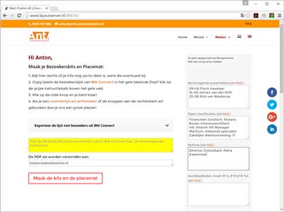
Printing lists, badges, receipts and feedback forms for BNI chapters – but in top quality
BNI chapters create their visitor kits here. Provide visitors to networking costs with personalized items, it only takes a few clicks. For example, a table card, a badge, a receipt, an evaluation form – and a placemat or note sheet on which all participants in the meeting are listed, members and visitors. Plus extra space for your own announcements or promotions.
And all layouted in just a few mouse clicks!
SEO: "BNI placemat", "print BNI note sheets" (pg 1, pos 1)
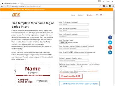
SEO: "BNI Badge" (pg 1 pos 2) Also look at the image results 🙂
Create your own badge online and print it yourself
Try it yourself with a demo design! This page offers a free badge template. Fill out a form and receive a formatted PDF for a professional badge. Network organizations, franchise organizations, cleaning companies – make sure you have a badge, ID card or window poster that supports the appearance of other media expressions!


